

Polishing the app both in user experience and visual design areas ahead of it's North America hard launch. Solving user pain points and improving user experience post launch, as well as implementing new ways to increase retention.
is an AI powered language learning app.
Introduction & Goals
The product and it's goal
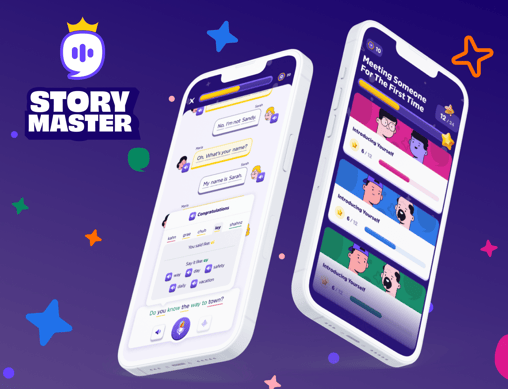
Story Master is an AI-powered language learning app that offers a fun and innovative approach to mastering new languages.
Developed in collaboration with language professors, the app ensures a structured curriculum for all language levels, while including fun and gamified elements. Features like fill-in-the-blank exercises, dialogue completion, speech practice, and a scoring system help keep users motivated and actively involved in their learning journey.

User journey, understanding the user's experience


User journey
A simple user journey chart to understand what will be the general experience of the user and what outcome they will get from our app.
Visual definition, shaping the UI
For Story Master’s look and feel, we aimed for the charm of a fun, nostalgic textbook—educational yet vibrant, with rich colors and engaging illustrations.


This approach perfectly complements our app, a curriculum-based learning experience infused with playful elements.
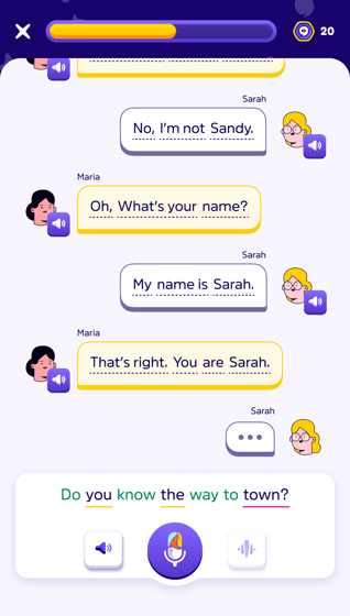
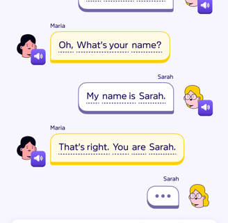
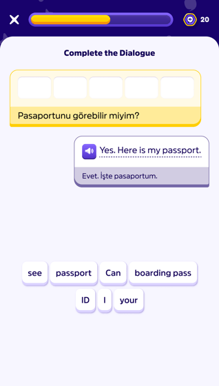
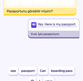
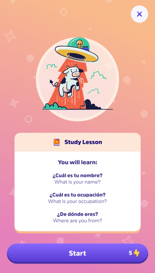
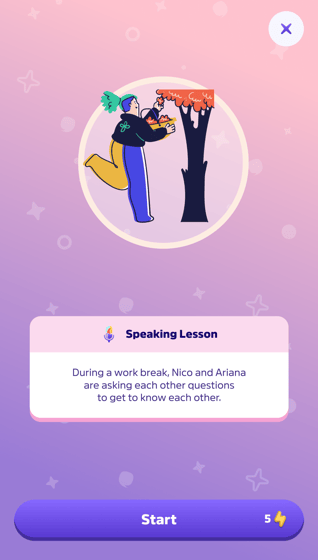
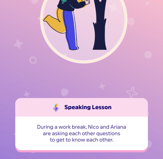
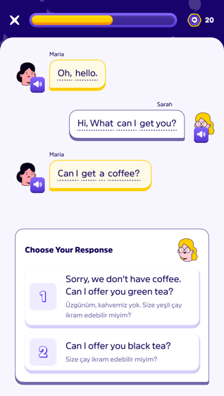
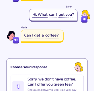
With fun illustrations and rich colors we made it as approachable and interesting as possible.
User experience, pain points, solutions
At this section I will write about some of the major pain points we encountered from user data and user session recordings, and how I created solutions for them.
"People are not using one of our strongest features enough."
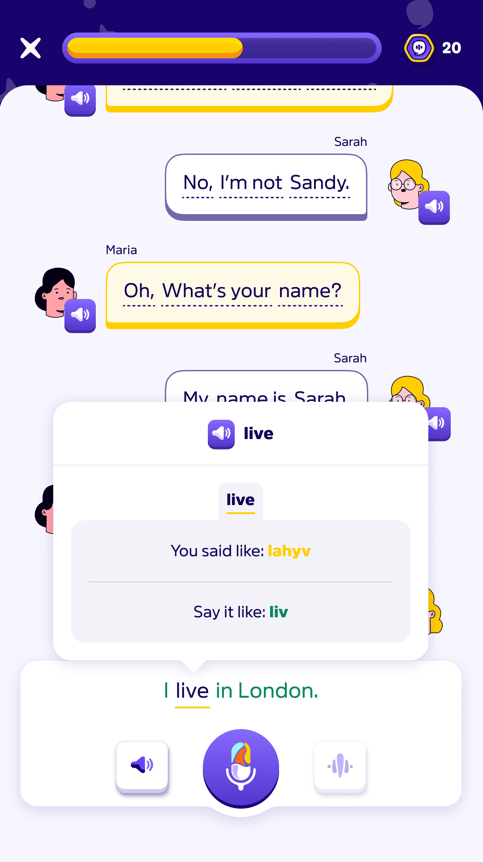
One of the best features we have implemented is how AI detects user's spelling mistakes down to syllables, and gives suggestions on how to spell them right.
On our user session recordings and user data, we recognized this feature isn't used enough. Even when the user's spelling is bad, they didnt use this feature to get better. Our take was they didn't understand how this feature works and how to make use of it. So we decided to create a different iteration, which is more understandable and easy to use.
Solution: Simplicity and effectiveness of classic 'color coding'.
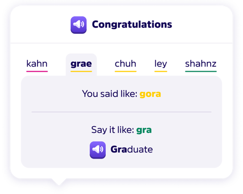
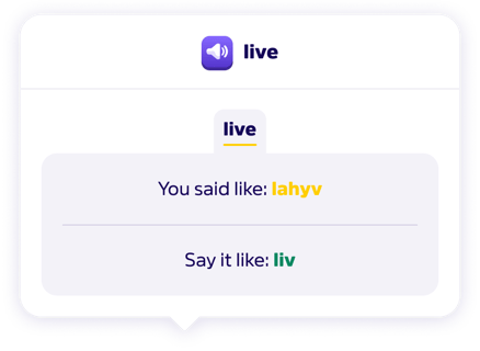
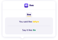
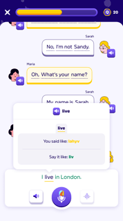
The iteration that seperates syllables into different sections and colors them based on how user performed on spelling (red being wrong, orange being close, green being exact), helped to increase the usage of this feature about 42%!
"People are dropping our product on the onboarding stage!"
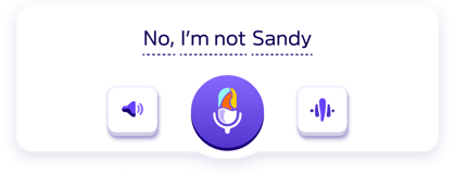


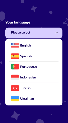
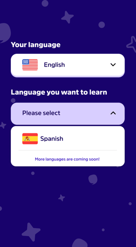
Another major issue we identified from user data was confusion during the onboarding process, leading to users dropping out. From selecting their known and target languages to understanding the app’s purpose and how to use it, key information needed to be clearer.
Better onboarding process to the rescue.
We decided to completely revamp our onboarding process, making it clearer, more intuitive, and adding helpful tutorials for newcomers.
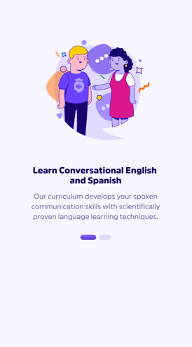
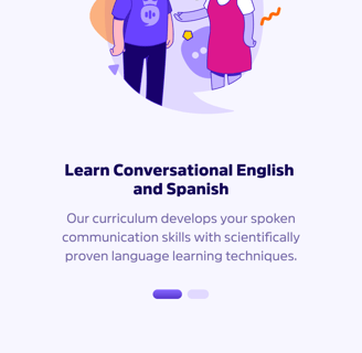
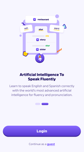
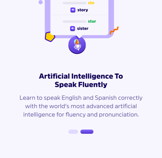
Welcoming onboarding cards summarizes what awaits the user inside.
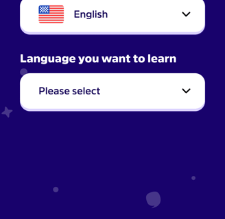
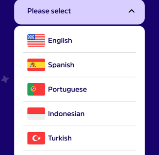
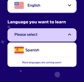
AB tested and easiest iteration of language selection screen allows user to state their known language and the target language they want to learn.
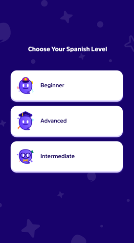
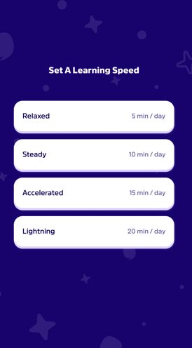
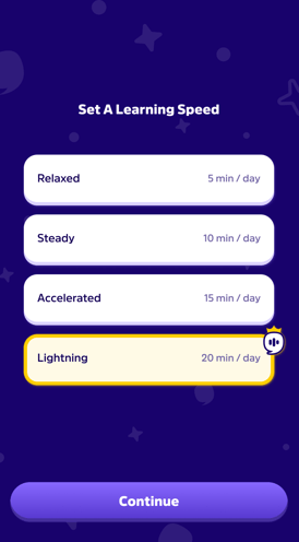
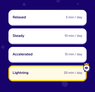
Making the user select a proficieny level allows us to put them on the right track with the correct curriculum.
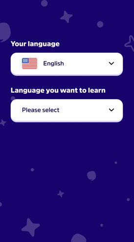
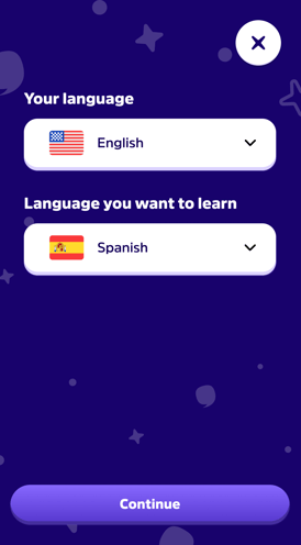
Lastly, we introduced dynamic tutorial guidance to support new users, helping them navigate the app’s most commonly misunderstood or overlooked features as well as teaching them about its basic functions.
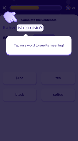
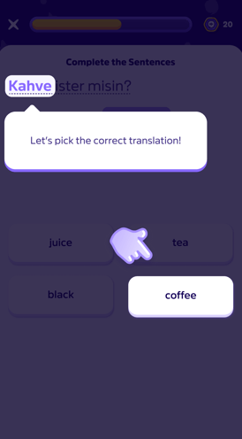
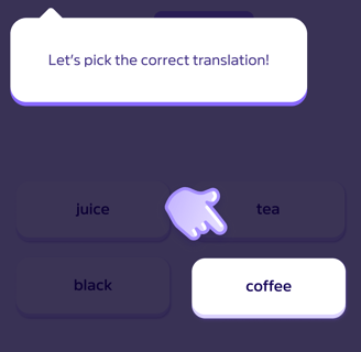
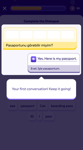
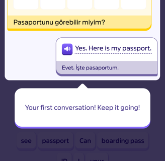
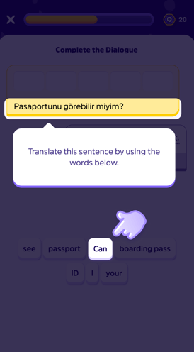
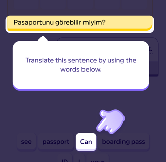
This multi-stage onboarding design significantly helped reduce early drop-offs.
Score system, retention
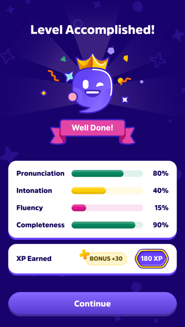
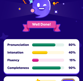
Our approach involved carefully designing the user journey, seamlessly integrating gamification elements such as points, badges, and leaderboards to sustain engagement. This wasn’t just about adding superficial game mechanics; we aimed to make gamification a natural part of the curriculum progression. Users are scored and rewarded for their performance—whether it’s accurately spelling a syllable or achieving greater fluency than in previous levels. The result is a learning experience that is enjoyable, rewarding, and highly effective, allowing users to clearly see and feel their progress while ensuring they make consistent improvements in a fun and engaging way.


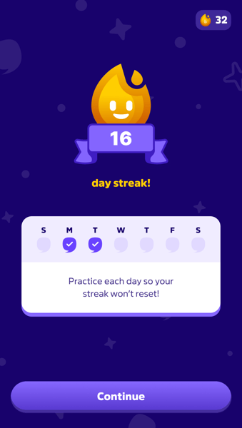
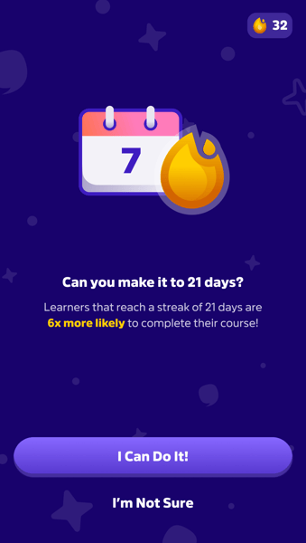
We also introduced a streak system in Story Master, encouraging users to log in daily to maintain their learning momentum. By rewarding consistency, this feature not only helps users steadily improve but also boosts engagement and motivation. The psychological drive to maintain a streak creates a sense of achievement and accountability, ultimately increasing retention and keeping users actively involved in their learning journey.
